It’s all fine ‘n’ dandy to have a pretty website. But if it doesn’t get your visitors to the information they came to find – what’s the use?
Upping the ante – along with getting your visitor what they want, are you guiding them to take actions based on their interests that will further your business? This is all part of building effective website navigation.
Website navigation plays not only a big role in user experience but also SEO.
- If Google’s crawlers can naturally navigate through your website they can more easily serve up your content to those looking for it.
- When your visitors are finding what they’re looking for and being coaxed to engage further with your website instead of bouncing off – search engines will take notice. These prolonged and engaged visits are indicators that your site has valuable information search engines’ users might be interested to see.
So how do you lay out your website navigation so it will help both your visitors and yourself?
#1: Know who your visitors are and what they want
How do we do this? In theory, you already know most of the answer. You see who’s taking their credit card out, you hear the questions, you notice the ‘just browsers’ and tire kickers – especially if you have a brick-n-mortar or have any kind of communication with your clients/customers.
But online there are ways we can see what our users are interested in.
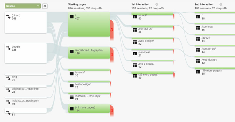
Google analytics:
If you don’t have it, get it. I’m serious. Even if you don’t think you’ll ever use it; it’s free, it doesn’t take long to set up, it doesn’t affect your website’s performance or require upkeep – better safe than sorry.

This is a standard with every website we build. A lot of clients don’t know what it can do or how to use it but you wouldn’t believe how many times someone will come back months or years after launch and say: “I wish I knew how many people saw (insert page on) my website.” or “Where are all these people coming from.” and we are able to WOW them with an actual answer and in most cases teach them a few more things they can do with the information.
The ways of using Google Analytics is an entire blog post in itself but just keep in mind these numbers are based on the current set up of your website so if topics are missing or less accessible then others this will reflect in your google analytics. For example – if you don’t have your services page in your current menu or prominently displayed on your homepage you probably will not see much traffic to your services page – that doesn’t necessarily mean your visitors are uninterested – it could mean they haven’t had the chance to show their interest.
Social & Email:
A quick scan through your social posts and email reports will give you an idea of which intrigue your visitors the most and which actions you successfully got them to do. If you send promotional emails, hopefully, you’ve chosen a platform that lets you track who opens the emails and what links they’re clicking. This data is incredibly valuable when putting together visitor profiles.
#2: Know what your website goals are
See your services? Inquires? Email sign ups? Walk-ins? Event registrations? Information downloads? Social followers? Video views? Quote requests? Reservation requests? Sales? WHAT DO YOU WANT?
#3: Develop CTA’s to reach your goals
Call – To – Action: We’re talking flashy buttons, easy to fill out contact forms, and simple to use e-commerce all with attractive lure copy that further play up the interests of our users.
#4: Match ’em all up
By answering the questions above you’ve already started to develop your website map. Last step is to just match each interest of your website viewers with an action they’re most likely to take that aligns with a goal you want to achieve.
Based on the type of information they’re looking for, what Action do you want that particular visitor to take? What action could you naturally get them to take?
For example: If a visitor is looking at your rates – a natural action might be to – purchase, book, view availability, or learn more.
Implementing Website Navigation
Some locations to implement your desired navigation include:
- Header -> Main Menu – directions for your top users & goals
- Footer -> Secondary Menu – unique/uncommon users (a user automatically knows if what they’re looking for is usual or unusual. Most users with unusual goals will head to the bottom of the page to find potential answers. – Exception – contact
- On-page links – These correlate with #4 from above – the action you want each user to take based on where they are on your website.

My rules of thumb
- Have only one (main) Call To Action per page.
- The homepage could have one CTA per section because this is where an online ‘window shopper’ will be scrolling down looking for something to catch their eye.
- Design-wise these CTA’s should stand out/be appealing and clearly state what they’re getting into.
- Avoid multiple drop-downs at all cost – mega menus are great – just don’t forget your mobile user.
One-page websites
Not all businesses require multiple pages and that’s fine – sometimes a benefit (one page to load – faster delivery.) But this doesn’t mean you’re off the hook for navigation, it just means you’ve got a simpler task.
Tip: Utilize anchors for a menu.
If your page is lengthy, anchors are a good way to get your user directly to the information they’re looking for without making them scroll and scroll or scan and search. When you click on an anchor button or tab, it will pull the screen to the exact spot on the page you want to go to. Imagine a website with a whole list of prices, pictures, or options in one place. You can scroll down to find what you want, or just click the anchor and it will pull you right where you want to be.
I love anchors. – Paige Johnson

If you told me a few years ago I’d sign my name to that sentence I would have said something like “Oh yeah and I’ll also be a zero-cat household.” But that’s because I had only ever dealt with anchors (against my will) in emails that had no business being as long as they were. My disdain for anchors took some time to get over, but once I came around to them I find myself sprinkling them on multi-page websites as well as the single pages.
So let’s say it together: “Paige loves cats and anchors.”
The next time you see a pretty website, take a second look. Is its beauty only screen-deep or does it go further – allowing you to find what you need and offering opportunities that will mutually benefit yourself and the owner of the website? If you can answer yes to beauty and function – that’s what we call PURRfection (an industry term).


